YouTube thumbnail ideas that actually work (with examples)
Most thumbnail idea lists are moodboards. This one breaks down the patterns behind high-performing YouTube thumbnails by niche — and what to steal from each.
5 min read ThumbnailsYouTubeDesignGuidesPopularMost "YouTube thumbnail ideas" posts are just galleries. Pretty, useless. You scroll, feel vaguely inspired, and still don't know what to make for Friday's upload.
This one breaks each example into a **pattern** you can reuse — face + stakes, product hero, curiosity gap, before/after, text-forward edu — plus a note on why it still reads when it's the size of a postage stamp. Steal the pattern, not the pixels.
Rules that work in every niche
Before the gallery, a few constraints almost every strong thumbnail shares:
If you want the deeper "why," read [the psychology behind thumbnails that get clicked](/blog/youtube-thumbnail-psychology). And if you're unsure whether CTR is even the right number to chase, the [CTR optimization guide](/blog/ctr-optimization-guide) is worth ten minutes.
Gaming — stakes you can see
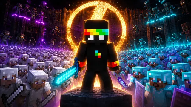
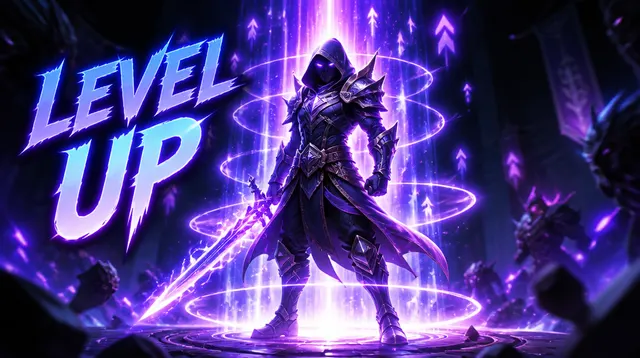
**Pattern:** big subject or character + a readable stake ("1000 players," "level 1," "admin"). Motion and scale beat subtle atmosphere.
**Steal this:** Make the game moment obvious from across the room. One number or short phrase is enough. Don't bury the hook in a busy HUD screenshot.
Tech & reviews — product as the hero

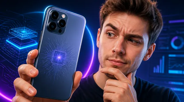
**Pattern:** the product fills the frame on a clean or high-contrast background. Optional face for reaction. Short verdict text ("worth it?" / "don't buy").
**Steal this:** Light the product like an ad. Kill clutter. If you're comparing two things, make them unequal in size so the eye has a winner to look at first.
Finance & money — desire and proof

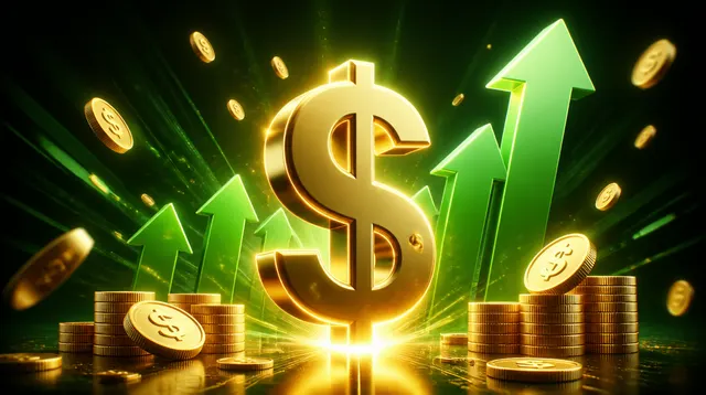
**Pattern:** cash, charts, or lifestyle payoff at large scale. Text is optional; the *result* is the star.
**Steal this:** Show the outcome, not the spreadsheet. One big visual metaphor beats five small icons. Keep claims honest — YouTube notices bait that doesn't match the video.
Food — appetite appeal
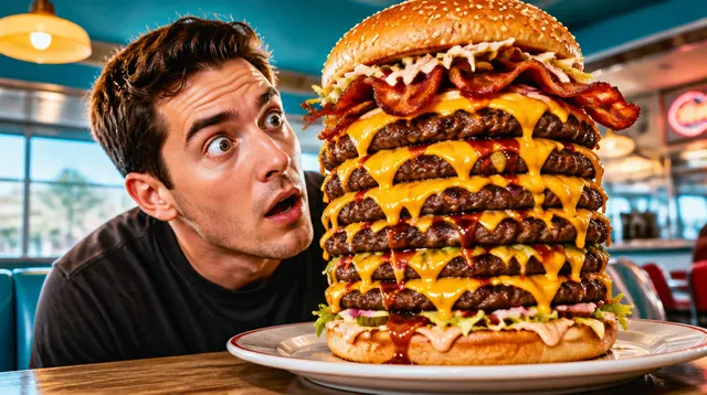
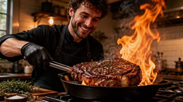
**Pattern:** hero food shot, extreme close-up, saturated color. Face optional for reactions or challenges.
**Steal this:** Steam, gloss, and scale. Crop tighter than feels comfortable. Text belongs next to the food only if the reaction is the story.
Fitness — before/after and transformation
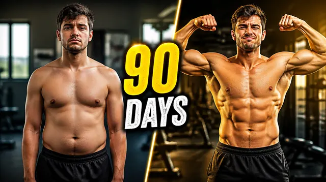

**Pattern:** split or side-by-side progress, or a single peak moment (summit, finish line). Emotion on the face sells the journey.
**Steal this:** Make the "before" and "after" read at a glance — same pose, different result. Or skip the split and show one decisive moment with short text.
Education & productivity — text-forward clarity
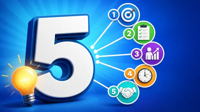
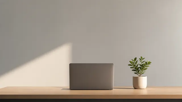
**Pattern:** face or workspace + three to five huge words. Bright background. The thumbnail restates the promise of the title in shorthand.
**Steal this:** Front-load the benefit ("5 tips," "stop doing this"). If the text needs a second line, the title should carry the rest.
Challenge & vlog — emotion and stakes
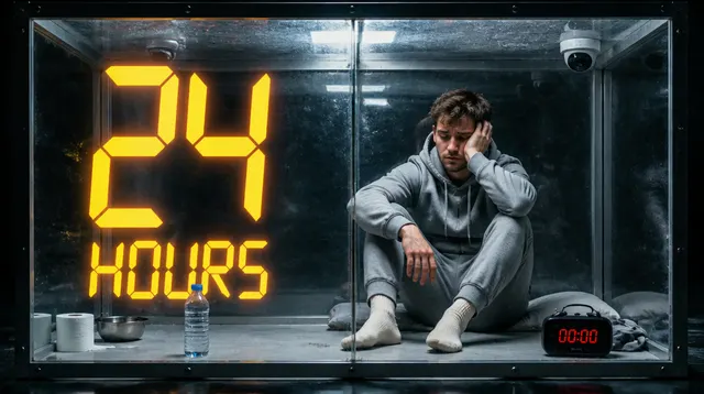
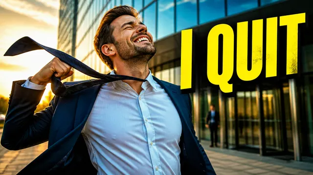
**Pattern:** expressive face + a situation you can understand without audio. Time-boxed challenges ("24h") work because the stake is visible.
**Steal this:** Capture the peak emotion, not a polite smile. Put the constraint (time, place, rule) in the image or in three words of text.
Horror & true crime — intrigue without the gore
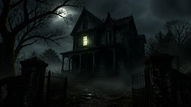
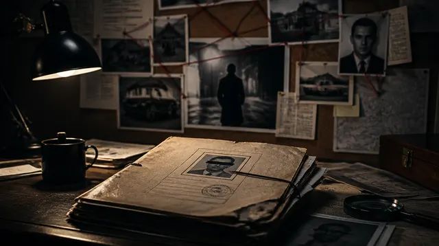
**Pattern:** atmosphere, negative space, a single unsettling detail. Faces work when the expression is fear or intensity — not when the frame is a crime-scene dump.
**Steal this:** Suggest the story. One object, one doorway, one silhouette. Viewers lean in when they have to finish the sentence themselves.
Faceless & illustrated — subject over selfie
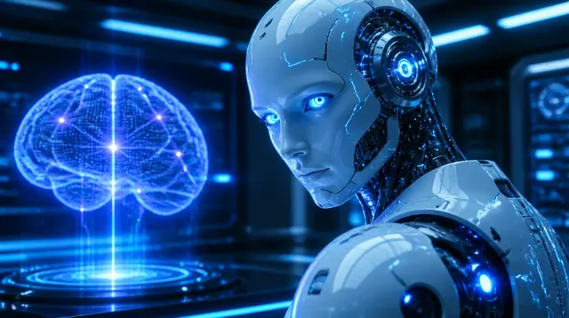
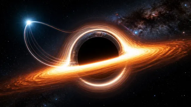
**Pattern:** a single, huge subject (object, map, illustration) on a clean or dramatic ground. No face required.
**Steal this:** Scale up the subject until it feels slightly wrong. Faceless channels lose when everything in the frame is the same size.
How to use these ideas without copying
Want the pattern built for you from a video link? [Thumbly's YouTube thumbnail generator](/youtube-thumbnail-generator) turns a URL into finished options in about half a minute. Run the winner through the tester before you upload.
FAQ
**What makes a good YouTube thumbnail?** One clear focal point, a single emotion or question, and text that still reads at feed size. Standing out from the thumbnails next to yours matters more than being "loud" in isolation.
**How do I get ideas for my niche?** Study what's already ranking, extract the pattern, then rebuild it for your topic. Don't clone a specific layout pixel-for-pixel.
**Do I need a face?** Only when emotion or identity sells the click. Product, food, and illustrated niches can win without one.
**How much text?** Three to five words is the usual sweet spot. Longer copy belongs in the title.