We scored Ryan Trahan's thumbnails, then tried to beat them
Ryan Trahan's rule is a subtle face, a clean background, and whatever is going on. We ran two of his thumbnails through Thumbly Score, applied the fixes, and re-scored.
4 min read ThumbnailsYouTubeTeardownCreator BreakdownPsychologyRyan Trahan has a thumbnail rule he said out loud. Subtle face over the crazy reaction. Clean background. His face, then whatever is going on. He called the whole thing a pretty photo, almost a canvas.
We took two of his, a collab that puts MrBeast next to a giant penny and a split that sells Economy vs First Class, and ran them through [Thumbly Score](/thumbly-score). Same flow as the [MrBeast](/blog/mrbeast-thumbnail-teardown) and [MKBHD](/blog/mkbhd-thumbnail-teardown) teardowns. Score the original, apply the one-click fix, score again.
Thumbnail 1: "I Survived On $0.01 For 30 Days"
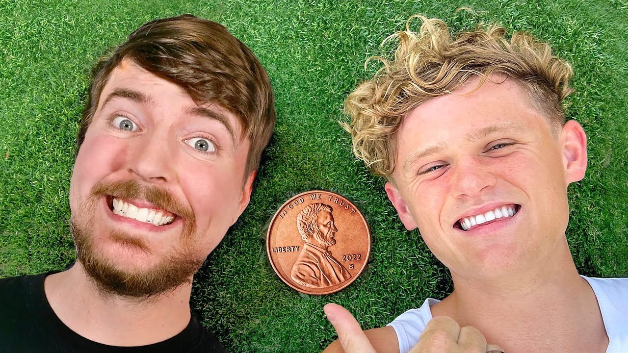
Top-down on bright green grass. Ryan in a white tank, thumbs-up. MrBeast in a black shirt, already grinning. A giant 2022-S penny sits between their heads, Lincoln facing up. No title text. The stake is the destination person, not just a coin.
**Thumbly Score: 82/100**
| Dimension | Score |
|---|---|
| Virality | 90 |
| Clarity | 85 |
| Idea | 75 |
| Curiosity | 80 |
| Emotion | 80 |
The verdict it returned: *"Strong brand recognition and clear visual, but the flat lighting holds back its impact."* That tracks. You read this in a fraction of a second. Two faces you know, one object you don't expect at that size.
What we like is the discipline. One background, one prop, two faces. He didn't stamp "$0.01" on the grass or drop a second challenge in the corner. The penny is the "whatever is going on." MrBeast is why you believe the video is bigger than a coin trick.
The soft spot is the light. Everything is even and bright, so the penny and the faces sit on the same plane. Thumbly wanted a harder key from the upper left, a slightly bigger penny, and more shock on Beast's face. This is what came back:
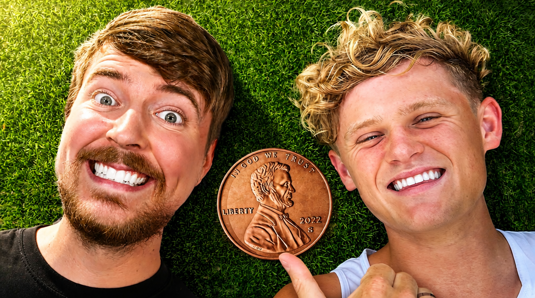
**85/100, up three.** Virality and clarity didn't move. Emotion jumped from 80 to 88 once the light carved the faces and the copper. At 82 you're not redesigning the joke. You're making the penny feel like it has weight.
Thumbnail 2: "I Tried Every Seat on the Most Expensive Airline"

Split down the middle. Economy on the left, First Class on the right, same face twice. A red airline widget sits on the cheap side, a gold one on the fancy side.
Economy is a white tee, a stained paper cup, a torn blue seat. First Class is sunglasses, a black blazer, a gold neck pillow, a porcelain cup with a glittery gold drink. The video is about the most expensive airline. The thumbnail is a comparison, not a cabin tour.
**Thumbly Score: 79/100**
| Dimension | Score |
|---|---|
| Virality | 80 |
| Clarity | 90 |
| Idea | 75 |
| Curiosity | 70 |
| Emotion | 80 |
Clarity at 90 is the easy part. You get the joke before you read the title. Curiosity at 70 is the problem. The idea is clean and the First Class side is pretty. Pretty is not the same as "I have to know how bad Economy was."
The verdict said the emotional contrast could be amplified. Thumbly wanted more discomfort on the Economy face, a richer gold grade on First Class, and a drink that looked like a real luxury pour instead of a glitter block.

**83/100, up four.** Curiosity moved from 70 to 80. Emotion went to 88. Virality picked up five. The Economy frown is more honest, the First Class side is warmer, and there's a little steam on the cup. Same split, clearer stake.
What Trahan teaches
He already said the useful part. People connect with a subtle face more than an inaccurate crazy reaction. The First Class side is that idea in a blazer. The Economy side only started scoring like a click once the face stopped being polite about it.
The other half of his rule is the canvas. Clean background, his face, whatever is going on. On the penny thumb, "whatever is going on" is a giant coin and MrBeast. On the airline thumb, it's the comparison. Neither one needs arrows. When Score called the airline short on curiosity, the fix was a clearer feeling, not more labels.
That's the note for everyone else too. If your thumbnail comes back pretty and not "have to click," the missing piece is usually the stake. [Run it through Thumbly Score](/thumbly-score) and see which side you're on. The same series already did [MrBeast](/blog/mrbeast-thumbnail-teardown), [MKBHD](/blog/mkbhd-thumbnail-teardown), and [Colin & Samir](/blog/colin-and-samir-thumbnail-teardown). For why a face plus one object works in the first place, [the psychology of a clickable thumbnail](/blog/youtube-thumbnail-psychology) is the longer version.
*Thumbnails © Ryan Trahan, shown here for commentary and analysis. The "improved" versions are AI-generated edits made with Thumbly to illustrate the suggested changes.*