We ran MrBeast's thumbnails through Thumbly Score, then tried to beat them
MrBeast spends millions getting thumbnails right. We scored two of his biggest ones with Thumbly, applied the fixes it suggested, and re-scored. Here's what held up, what we'd change, and what you can steal.
5 min read ThumbnailsYouTubeTeardownPsychologyWe built a thumbnail scorer, so the obvious thing to do was point it at the guy who treats thumbnails like a lab experiment. MrBeast reportedly tests dozens of versions per video and has built a whole production process around the click. If anything's going to find the edge of an AI critic, it's his work.
We took two of his biggest thumbnails, ran them through [Thumbly Score](/thumbly-score) (it rates a thumbnail 0 to 100 on virality, clarity, idea, curiosity, and emotion), used the one-click fix to apply its suggestions, and scored the result again. Same flow you'd run on your own thumbnail. The numbers below are what came back, including the parts that didn't move.
Thumbnail 1: "$456,000 Squid Game In Real Life!"
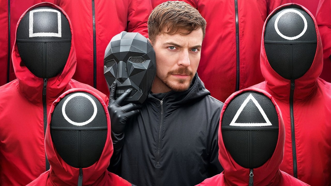
This sits on his most-viewed video. It's almost ruthlessly clean: MrBeast dead center, a Squid Game mask held up beside his face, four guards around him in that red. No text, because it doesn't need any. Everyone recognized the reference on sight.
**Thumbly Score: 85/100**
| Dimension | Score |
|---|---|
| Virality | 90 |
| Clarity | 95 |
| Idea | 75 |
| Curiosity | 85 |
| Emotion | 80 |
The verdict it returned: *"A highly effective and instantly recognizable thumbnail leveraging a popular creator and a global trend."* Fair enough. Clarity at 95 is the standout. You know what the video is in a fraction of a second.
The thing we like most is the discipline. One subject, one prop, one color. Plenty of creators would have packed a money pile and an arrow in here and lost the image in the noise. He trusted it.
The weak spot is idea, at 75, and that tracks. The thumbnail borrows its recognition from Squid Game instead of building its own, which is a smart move when a trend is this hot but caps how high a borrowed concept can climb. Thumbly's suggestions all pushed the same direction, harder focus on the center: darken the red behind his head, add a thin glow on the mask so it reads against his jacket, pull the saturation down on the guards so the eye lands on him. Here's the result:
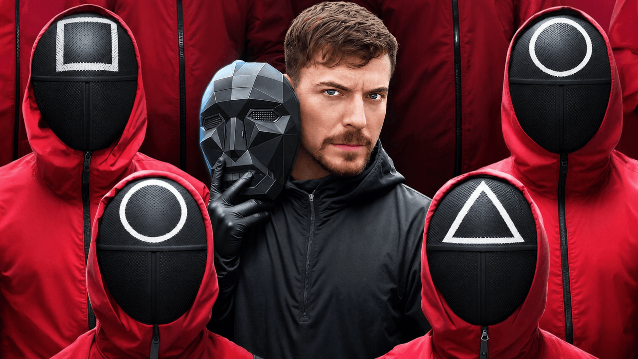
**91/100, up six.** Virality went to 96, curiosity to 93. It's the same thumbnail. The difference is separation, and at the size most people actually see it, that extra pop off the background is what turns a glance into a click.
Thumbnail 2: "7 Days Stranded On An Island"
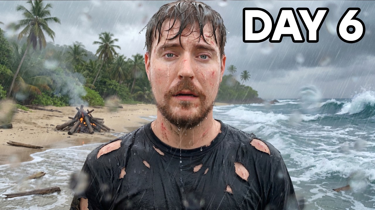
Completely different gear. This one runs on emotion. MrBeast standing soaked and scratched up in the rain, a campfire behind him barely alive, rough surf to the side. The only text is "DAY 6" in the corner. The image tells the story by itself.
**Thumbly Score: 90/100**
| Dimension | Score |
|---|---|
| Virality | 90 |
| Clarity | 95 |
| Idea | 80 |
| Curiosity | 90 |
| Emotion | 95 |
Emotion at 95 is the engine, and the exhaustion on his face earns it. No caption competes with that look.
What works here is the restraint, plus one quiet detail: the dying fire. He's six days in and can't even keep a flame lit. That says more than "watch me survive" ever would, and "DAY 6" on its own implies a week you've already missed. Most people would have stamped three lines of text across this and trampled the moment.
If we're nitpicking, the one soft spot is separation. His wet face sits against a gray, rainy background of a similar tone, so it doesn't quite punch at feed size. This thumbnail doesn't need anything added to it. It needs the subject lifted. So we left the real image untouched, the fire still dying and "DAY 6" still the only text, and just graded it: a bit more contrast and a soft vignette to pull the eye to his face.
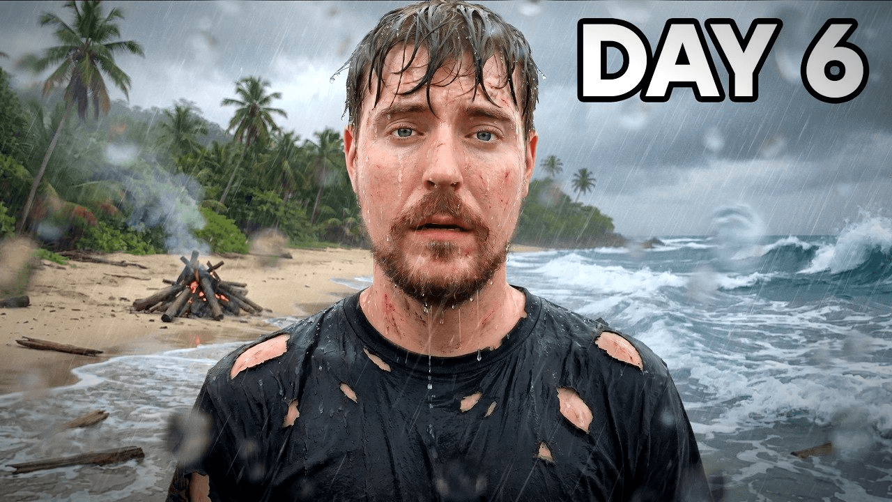
**91/100, up one.** The smallest move in this whole post, and the right one. At a 90 you're not redesigning anything. You're hunting for the single thing holding it back and leaving the rest alone. Relighting that fire or stacking on text would have cost points by stepping on the struggle that makes it work.
What MrBeast gets right
Two thumbnails, two opposite styles, the same playbook underneath.
He keeps one subject large in the frame, a face or a single focal point you read instantly, never a crowd of competing elements. He separates that subject hard from the background, which was the fix Thumbly kept reaching for on his work and the one it'll reach for most on yours. He lets the picture carry the idea: the Squid Game thumbnail has no text at all, and when text does show up it's a few big words, not a sentence. And he leans on emotion over information, because a worried person beside a dying fire beats the words "survival challenge" every time.
Scoring these makes one thing clear. Even elite thumbnails leave points on the table, almost always in the same spots: separation, contrast, text hierarchy. The gap is that his are sitting at 90 and reaching for 95, while most thumbnails are stuck around 55 with no idea which fifteen points to grab first.
That's what a score is for. If you want to see where yours lands, [run it through Thumbly Score](/thumbly-score) and it'll hand you the three things to fix. For why these images work in the first place, [the psychology of a clickable thumbnail](/blog/youtube-thumbnail-psychology) digs in, and [your CTR is lying to you](/blog/ctr-optimization-guide) covers what to watch after you hit publish.
*Thumbnails © MrBeast, shown here for commentary and analysis. The "improved" versions are AI-generated edits made with Thumbly to illustrate the suggested changes.*