We scored MKBHD's thumbnails: how little can you get away with?
MKBHD's brand is clean product photography and almost no clickbait. We ran his Humane AI Pin thumbnail and a near-textless iPhone 17 shot through Thumbly Score to see where minimalism wins, and where it leaves emotion on the table.
4 min read ThumbnailsYouTubeTeardownCreator BreakdownPsychologyMost teardown subjects in this series fight for attention. MKBHD already has it. Marques Brownlee's channel runs on trust and production value: clean reviews, careful lighting, a visual brand so consistent you can spot his hand holding a phone from across the feed. The Creators page on Thumbly lists him at 19M+ subscribers for a reason. The question worth asking is how little packaging he can ship and still look like the obvious click.
We took two thumbnails on opposite ends of his style, one concept-heavy and one almost pure product, ran them through [Thumbly Score](/thumbly-score), applied the fixes, and scored again.
Thumbnail 1: "The Worst Product I've Ever Reviewed... For Now"
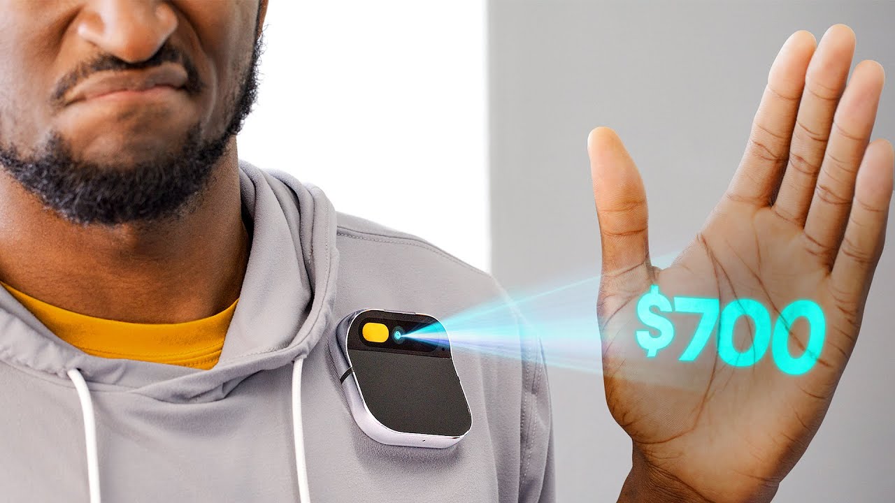
Half of Marques's face, grimacing. Humane AI Pin clipped to a grey hoodie. A cyan "$700" projected onto his open palm. No title text on the image. The whole story is price plus skepticism, which is exactly what that review became known for.
**Thumbly Score: 75/100**
| Dimension | Score |
|---|---|
| Virality | 60 |
| Clarity | 90 |
| Idea | 80 |
| Curiosity | 80 |
| Emotion | 70 |
This is the version of minimalism that still has a spine. Clarity at 90 because you understand the claim instantly: expensive gadget, unhappy reviewer. Idea at 80 because projecting the price out of the pin itself is a better hook than stamping "BAD PRODUCT" in Impact font. Curiosity holds because you want the verdict behind the face.
What we like is the restraint. The pin, the price, and that grimace carry the whole thing. He didn't add arrows, flame emojis, or a second product for comparison.
Thumbly's notes were small and correct. Make "$700" about 15% larger so it holds at feed size. Darken the top-left background a touch so the grimace separates. Ease off the yellow shirt saturation so it stops competing with the cyan projection.
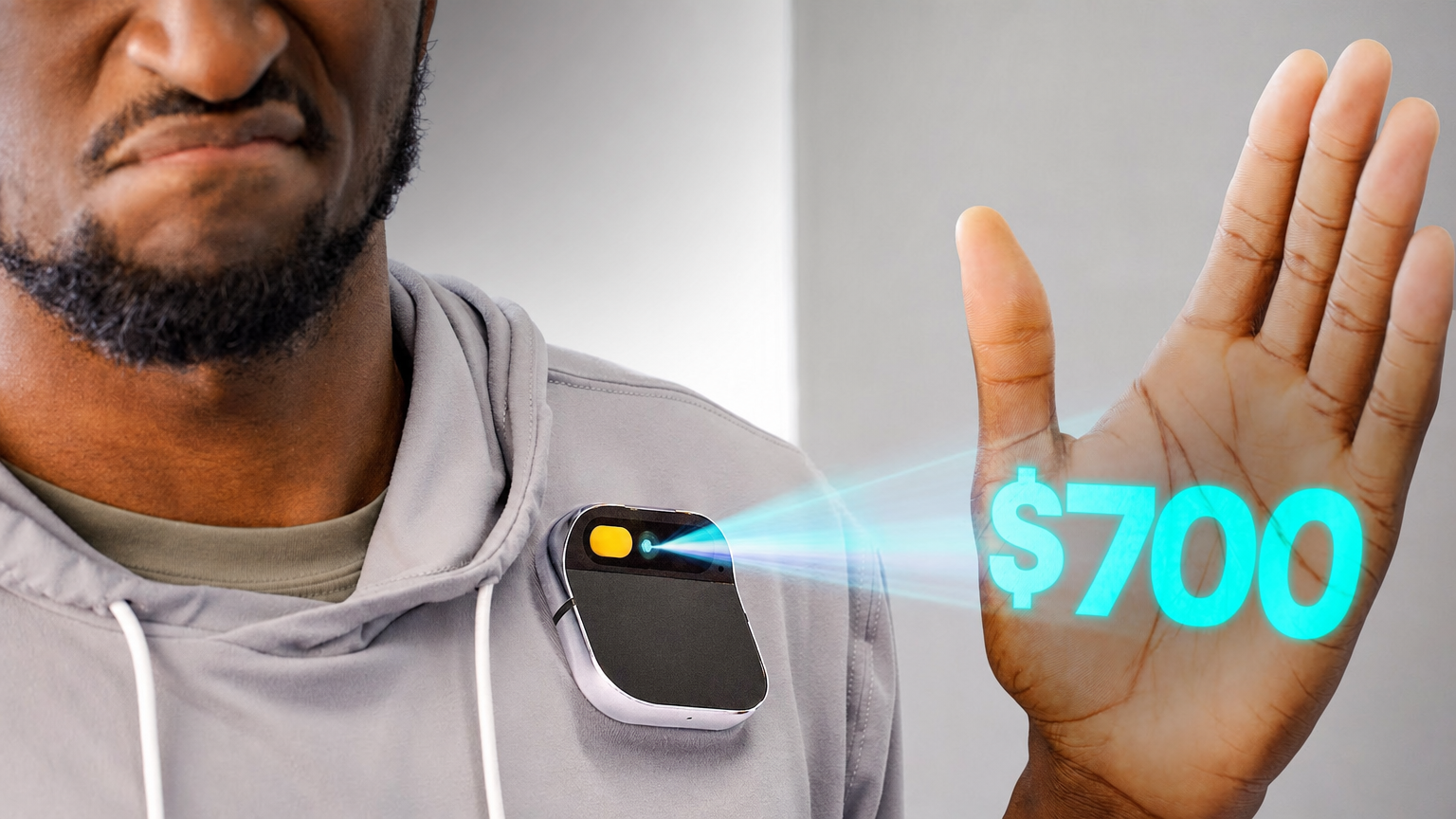
**83/100, up eight.** Same photo, same joke, cleaner hierarchy. Virality and curiosity both climbed once the price and the face were harder to miss. At 75 you're not redesigning anything. You're removing the two things fighting the punchline.
Thumbnail 2: "iPhone 17 Review: No Asterisks!"
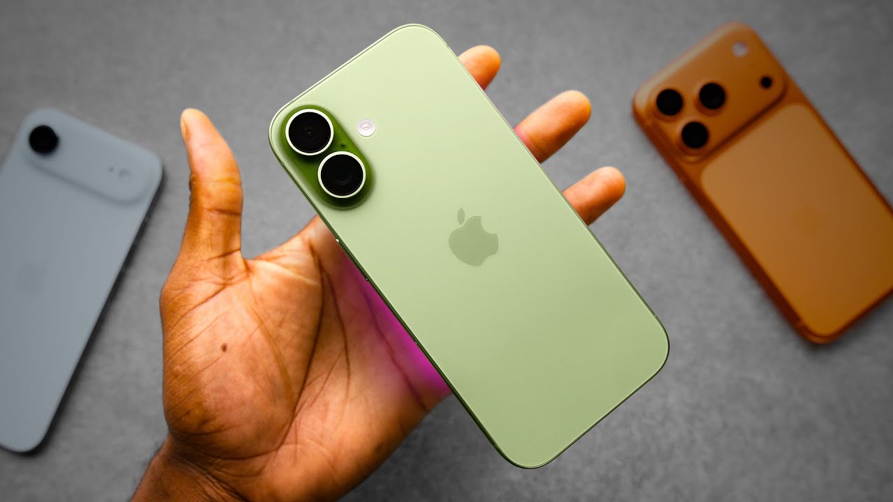
No face. Just Marques's hand holding a pale green iPhone, two other phones soft in the background, a little purple rim light under the device. This is the MKBHD house style at its purest: product as hero, brand recognized without a watermark.
**Thumbly Score: 55/100**
| Dimension | Score |
|---|---|
| Virality | 55 |
| Clarity | 85 |
| Idea | 40 |
| Curiosity | 65 |
| Emotion | 20 |
Emotion at 20 is the whole story. It's a beautiful product photo. It is not a feeling. Idea at 40 tracks too: a nice phone on a grey surface is what half of tech YouTube ships every September. Clarity is still high because an Apple logo reads in a fraction of a second, and for an audience that already clicks anything MKBHD posts, that may be enough.
This is the test case the series plan promised. How little can you get away with? With his channel, a lot. With a scorer that doesn't know your subscriber count, less.
Thumbly's tips went straight at the missing hook. Add a short contrasting line like "NEW iPhone?" Darken behind the green phone so it pops harder. Nudge the background phones a bit brighter so the comparison reads without stealing the shot.
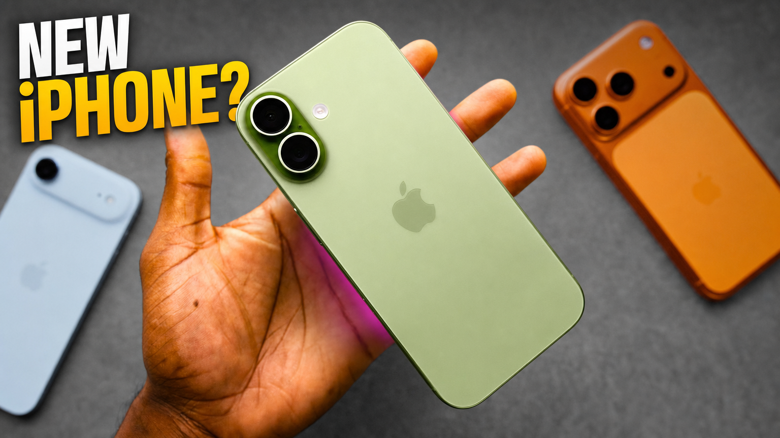
**80/100, up twenty-five.** Almost all of that jump is the text. Emotion climbed because the question gives the image a reason to exist beyond "look at this phone." Curiosity followed. The photography was already elite. The packaging needed a sentence.
Worth sitting with: the original may still be the right thumbnail for *his* audience. Brand recognition is a real asset, and a 19M-subscriber channel can lean on it. The score is useful because it shows what the image is asking of a stranger. A stranger gets a pretty phone. A fan gets MKBHD.
What MKBHD teaches
When the concept carries emotion (a price projected onto a skeptical palm), minimalism scores in the mid-70s and climbs with tiny separation fixes. When the image is only product beauty, clarity stays high and everything else sags. The fix isn't making it louder like MrBeast. It's giving the scroller one unresolved thing, even if that thing is three words in the corner.
He also shows that production value and packaging are different skills. The iPhone shot is better photography than most channels will ever ship, and it still scored 55 until a hook showed up. Lighting doesn't replace curiosity.
Brand is a cheat code you shouldn't copy blindly. Marques can post a hand and a phone because the hand is famous. If your hand isn't famous yet, steal the clarity and the single focal point. Don't steal the assumption that people already know it's you.
[MrBeast](/blog/mrbeast-thumbnail-teardown) overloads the frame on purpose. [Colin & Samir](/blog/colin-and-samir-thumbnail-teardown) bet on the line. MKBHD bets on the object. Each approach works when there's still a reason you can't quite look away.
Want to know whether your thumbnail is "pretty" or "have to click"? [Run it through Thumbly Score](/thumbly-score). For the psychology behind that gap, start with [the psychology of a clickable thumbnail](/blog/youtube-thumbnail-psychology).
*Thumbnails © Marques Brownlee / MKBHD, shown here for commentary and analysis. The "improved" versions are AI-generated edits made with Thumbly to illustrate the suggested changes.*