We scored Colin & Samir's thumbnails: does 'tasteful' cost you clicks?
Colin & Samir are the thinking creator's creators: restrained, editorial, no MrBeast theatrics. We ran two of their thumbnails through Thumbly Score to see whether good taste actually wins, or just feels nice.
4 min read ThumbnailsYouTubeTeardownPsychology[MrBeast](/blog/mrbeast-thumbnail-teardown) sells spectacle. Colin & Samir sell the opposite. Their channel is the creator economy's group chat: interviews, essays, a deliberately tasteful look, no screaming faces or red arrows. Which makes them a good test of a question we hear a lot. Does a scorer like ours just reward clickbait and dock you for having taste?
We ran two of their thumbnails through [Thumbly Score](/thumbly-score), applied the fixes it suggested, and scored them again. The answer was more interesting than a yes or a no.
Thumbnail 1: "10 harsh YouTube lessons we wish we knew at 21"
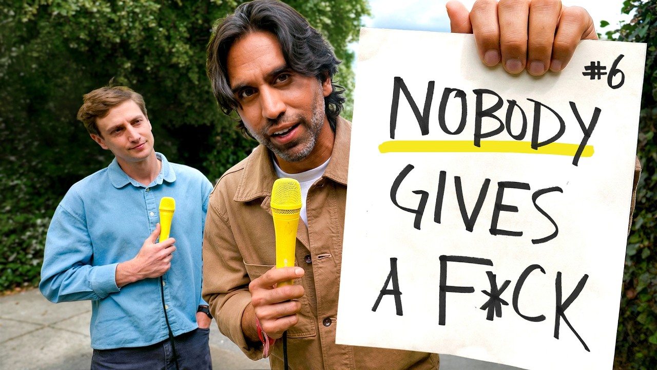
Samir up front with a mic, holding a handwritten sign that reads "NOBODY GIVES A F*CK," the word "NOBODY" underlined in yellow, a small "#6" in the corner. Colin's behind him, reacting. Greenery behind them. It's funny, it's human, and the sign carries the whole thing.
**Thumbly Score: 84/100**
| Dimension | Score |
|---|---|
| Virality | 80 |
| Clarity | 90 |
| Idea | 75 |
| Curiosity | 90 |
| Emotion | 85 |
Start with the headline number: a thumbnail with no spectacle at all scored an 84, right alongside MrBeast's best. The reason is the sign. "Nobody gives a..." about what? The "#6" tells you it's one of ten, so you've already missed five. Curiosity at 90 is doing the work, and it got there honestly.
The restraint is what we like. The joke lands because nothing fights it: one sign, two real reactions, a clean background. If you ever needed proof that the fix is a better line and not more arrows, this is it.
The lowest mark is idea at 75. The format itself, two people holding a sign, has been done to death. Thumbly's notes went after what was already working instead of reinventing it: thicken the yellow underline so it pops, push Colin's reaction in the back toward something more surprised, darken the foliage at the edges to pull focus in.
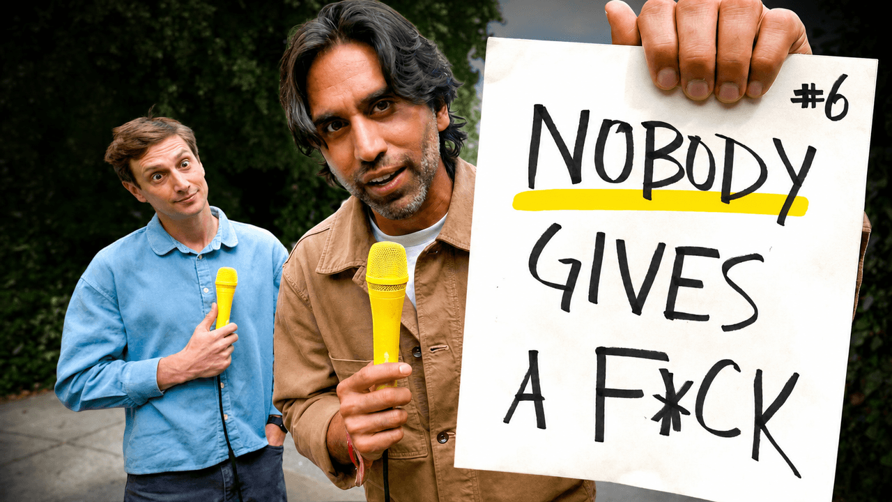
**91/100, up seven.** The stronger underline and Colin's bigger reaction add energy without touching what made it work in the first place. Same taste, a little more punch.
Thumbnail 2: "How SubwayTakes Became the Internet's Favorite Show"
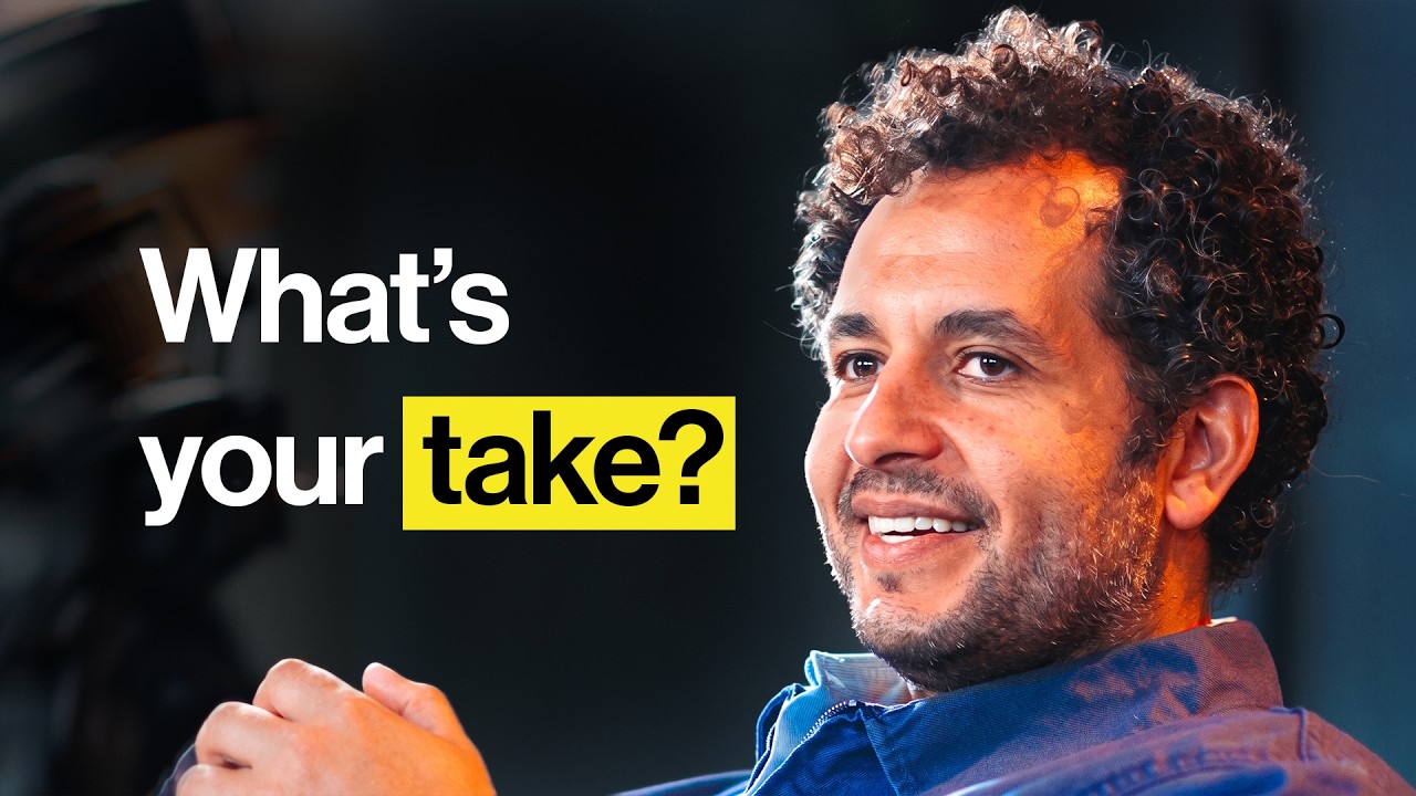
Samir mid-smile in a dark studio, "What's your take?" set big on the left, "take?" boxed in yellow. Clean, warm, on brand. This is the one that got interesting.
**Thumbly Score: 57/100**
| Dimension | Score |
|---|---|
| Virality | 30 |
| Clarity | 90 |
| Idea | 50 |
| Curiosity | 60 |
| Emotion | 65 |
Clarity 90, virality 30. That spread is the point. The thumbnail is pleasant. You know instantly it's a calm, friendly interview. But pleasant doesn't stop a thumb. There's no tension in it. "What's your take?" is a nice phrase attached to a question you don't actually need answered, so curiosity stalls at 60 and virality falls through the floor.
The good part: it's unmistakably them, and a 90 on clarity is real. Nobody's confused about what they're getting, and for an audience that already clicks anything C&S post, that's plenty.
Thumbly's fixes were the right kind of move. Add a rim light to lift Samir off the dark background, outline the yellow box, deepen the contrast so his face is the focal point:
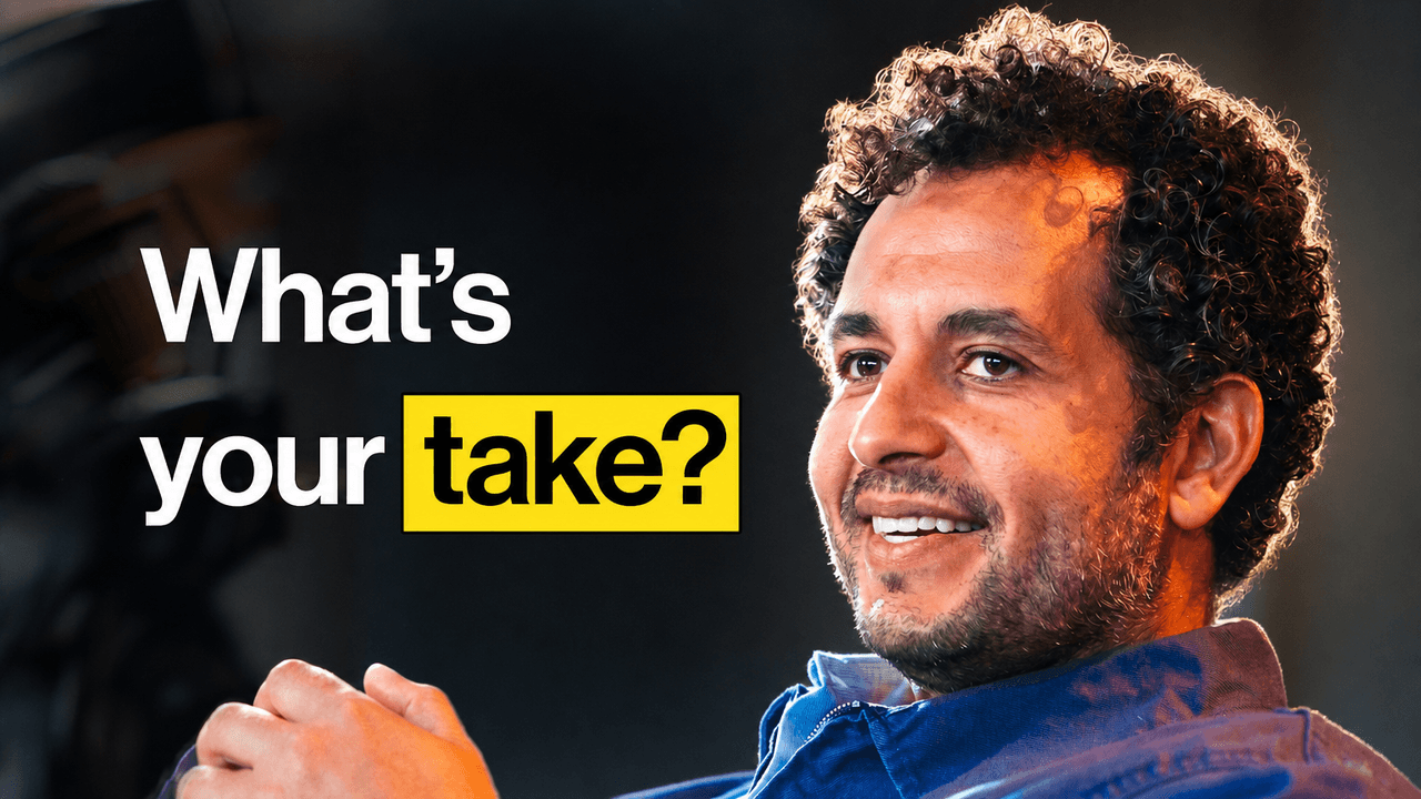
**65/100, up eight.** The separation helps and emotion jumps, but look where it lands. Virality only reaches 45, and it's still the weakest number on the card. That's the part worth sitting with. A rim light makes a calm thumbnail look better. It doesn't make anyone need to click it. Lighting was never the real problem; the concept is. A more loaded line, a sharper expression, something the viewer has to resolve. That's a rewrite, and no amount of retouching stands in for it.
What Colin & Samir teach
Set the two side by side and the takeaway is blunt. Good taste didn't cost them anything on the first one. The witty sign scored an 84 with zero spectacle, because there was still tension in it, and restraint works fine as long as something pulls. Clarity turned out to be necessary but not enough on its own: a thumbnail can be perfectly clear and still land at 57, because "I get it" and "I need it" are different reactions. And polish has a ceiling. Contrast and rim light are worth real points, but if the concept gives you nothing to be curious about, the score tops out no matter what. Fix the idea, then grade it.
MrBeast leans on spectacle, Colin & Samir lean on the line, and underneath they're doing the same thing: handing the scroller a reason they can't quite ignore. The only real difference is volume.
Curious whether your thumbnail is a "looks nice" or a "have to click"? [Run it through Thumbly Score](/thumbly-score). If it comes back like that SubwayTakes one, the answer isn't a filter, it's a better hook, and [the psychology of a clickable thumbnail](/blog/youtube-thumbnail-psychology) gets into how to find one.
*Thumbnails © Colin and Samir, shown here for commentary and analysis. The "improved" versions are AI-generated edits made with Thumbly to illustrate the suggested changes.*