We scored Aprilynne Alter's thumbnails: can the packaging teacher pass her own test?
Aprilynne Alter built a channel teaching YouTube packaging: titles, thumbnails, the psychology of the click. We ran two of her own thumbnails through Thumbly Score to see how the teacher scores.
5 min read ThumbnailsYouTubeTeardownCreator BreakdownPsychology[MrBeast](/blog/mrbeast-thumbnail-teardown) sells spectacle. [Colin & Samir](/blog/colin-and-samir-thumbnail-teardown) sell taste. Aprilynne Alter sells packaging: titles, thumbnails, the reason someone stops scrolling. She once spent 36 days studying 307 thumbnails across 46 creators and posted the notes publicly. Pointing Thumbly Score at her own work felt less like a dunk and more like a pop quiz.
Quick context, because the bio matters here. She quit finance on Wall Street in 2021, gave herself a year, and found YouTube after hearing Ali Abdaal talk about teaching on the platform. First channel got monetized in four months and roughly 20,000 subscribers in nine. The YouTube-strategy channel launched in 2023; by mid-2025 Tubefilter had her around 141K subscribers, with a Spotter partnership and a six-month Creator Crew cohort under way. Huge creators have used her videos as training material for new team members. She's not guessing about packaging.
We ran two of her thumbnails through [Thumbly Score](/thumbly-score), applied the fixes it suggested, and scored them again.
Thumbnail 1: "how to make a killer youtube thumbnail (to blow up your channel)"
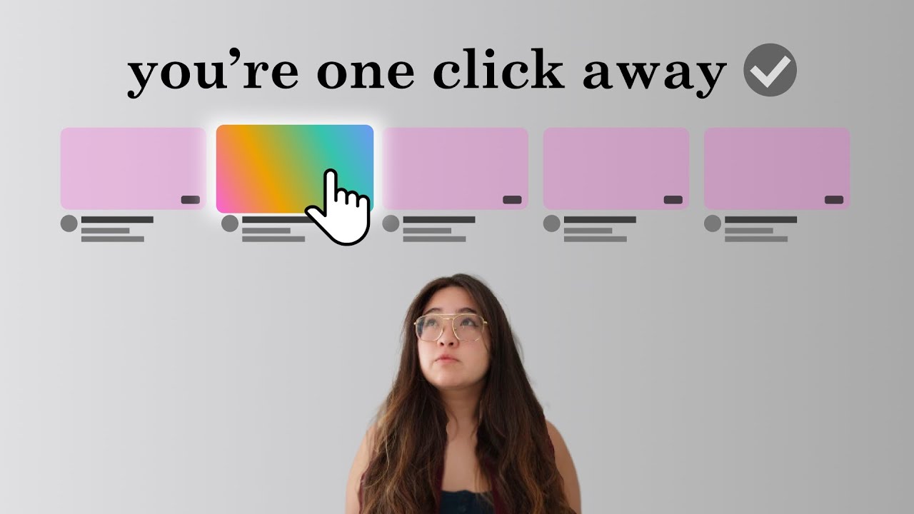
Aprilynne looking up at a row of five fake YouTube cards. Four are flat pink. One glows with a rainbow gradient, and a cursor is clicking it. The line above: "you're one click away," with a little checkmark. It's a clean metaphor for CTR. The video is literally about making killer thumbnails, and the image never says the word thumbnail. It shows the click instead.
**Thumbly Score: 64/100**
| Dimension | Score |
|---|---|
| Virality | 45 |
| Clarity | 90 |
| Idea | 65 |
| Curiosity | 75 |
| Emotion | 45 |
Clarity at 90 is fair. You get the choice-and-click story in under a second. Emotion at 45 is the soft spot: her face is thoughtful, not charged, and the pink cards don't push hard enough against the glowing one. Virality sits at 45 for the same reason. Clever, calm, a little polite.
Thumbly's tips stayed surgical. Open her mouth and raise the eyebrows so the reaction matches the "one click" payoff. Turn the word "click" yellow so the action word pops. Put faint X marks on the four pink cards so the rainbow choice wins harder.
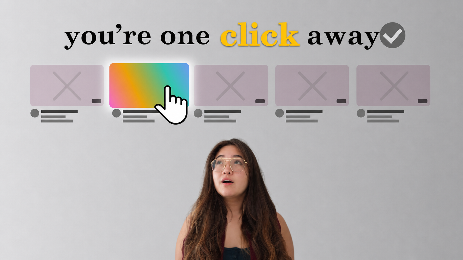
**71/100, up seven.** Same frame, same line, more tension in the face and a clearer loser/winner contrast in the feed. Emotion and virality both jumped. The concept was already good. It just needed the reaction and the contrast to catch up.
Thumbnail 2: "give me 8 minutes, I'll make your titles 81% better"
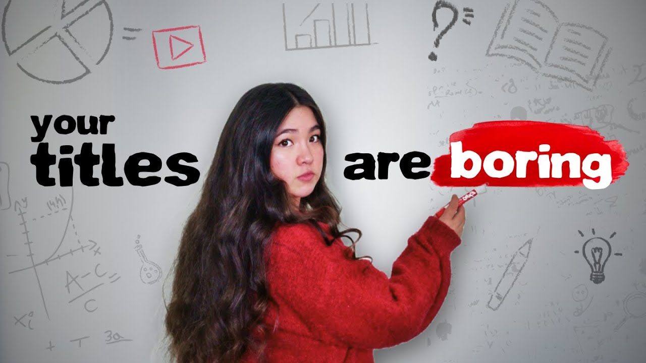
Different gear. She's over her shoulder in a red sweater, red marker in hand, looking back at you like you already know the answer. Across the wall: "your titles are boring," with "boring" stamped on a red brushstroke. Faint whiteboard doodles behind her: charts, a play button, a lightbulb. The line does almost all the work.
**Thumbly Score: 64/100**
| Dimension | Score |
|---|---|
| Virality | 40 |
| Clarity | 85 |
| Idea | 60 |
| Curiosity | 75 |
| Emotion | 65 |
Clarity and curiosity are doing their jobs. You know the topic, and the accusation is personal enough that a creator has to look. Virality at 40 is the honest part: this isn't built to travel outside the audience that already cares about titles. Idea at 60 is also honest. Face-plus-harsh-line is a proven edu-tube move, not a new one.
What we like is the confidence. She didn't pack the frame with arrows or money graphics. She wrote the insult and trusted it. Same instinct as Colin & Samir's "NOBODY GIVES A F\*CK" sign: one line, one reaction, leave the rest alone.
Thumbly wanted more of the same energy, not a redesign. Stronger "you need to fix this" face. A little outline on the red stroke so "boring" holds at feed size. Quieter doodles so they stay texture instead of competition.
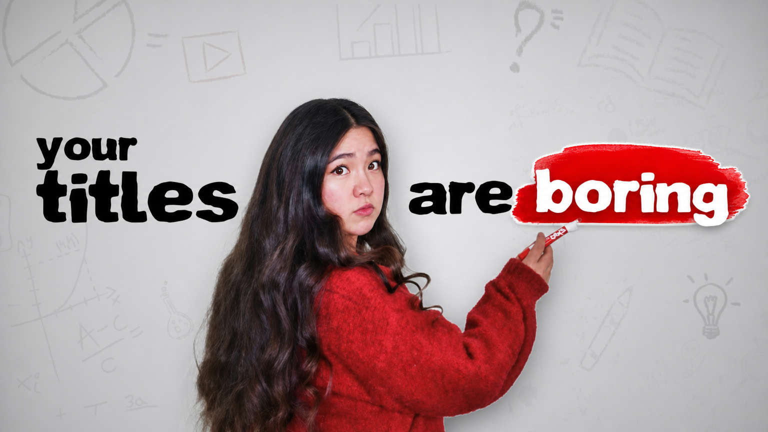
**77/100, up thirteen.** Virality jumped to 70. Emotion climbed. The line didn't change, which is the point. When the hook is already sharp, the score moves on expression and separation, not on inventing a new idea.
What Aprilynne Alter teaches
Her best packaging move is the line. "Your titles are boring" works the way a good title works: it names the viewer's problem out loud. The feed metaphor on the thumbnail video is smarter as a concept, but it needs a stronger reaction and harder contrast before it hits as hard as the blunt text.
She also proves you don't need spectacle to clear the mid-60s. Both originals landed at 64 with flat backgrounds and almost no visual noise. That's the opposite of the MrBeast playbook, and it still scores, because the idea is readable.
Polish has a real ceiling, too. Seven points on the metaphor thumbnail, thirteen on the titles one, both from emotion and contrast. Nobody needed a redesign. If your thumbnail is already saying something specific, the fix is usually making the face and the focal point louder, not starting over.
Aprilynne teaches packaging for a living. Her own thumbnails mostly practice it: a readable idea, her face, a short line. The gap Thumbly kept finding was volume, not strategy.
Curious how your packaging scores against the people who teach it? [Run it through Thumbly Score](/thumbly-score). For more on why a sharp line beats a busy frame, [the psychology of a clickable thumbnail](/blog/youtube-thumbnail-psychology) digs in.
*Thumbnails © Aprilynne Alter, shown here for commentary and analysis. The "improved" versions are AI-generated edits made with Thumbly to illustrate the suggested changes.*